---
layout: default-layout
needAutoGenerateSidebar: true
needGenerateH3Content: true
noTitleIndex: true
title: Dynamsoft Document Viewer User Interface - Customize Elements
keywords: Documentation, Dynamsoft Document Viewer, User Interface, Customize Elements
breadcrumbText: Customize Elements
description: Dynamsoft Document Viewer Documentation User Interface How to Customize Elements
permalink: /ui/customize/elements.html
---
# Elements
## Customize default elements
Although DDV provides many default elements, some customizations are also required, such as, to unify icon style with the original system, to add tooltips and so on.
- [Style & icon](#style-icon)
- [Event](#event)
- [Tooltip](#tooltip)
- [Display text](#display-text)
To change the style and icon of the default elements, can use the properties `style` and `className` of [`UiConfig`](https://www.dynamsoft.com/document-viewer/docs/api/interface/uiconfig.md), please refer to the example below.
**Use case**
- Change style and icon of `Dynamsoft.DDV.Elements.DeleteCurrent`.
```typescript
{
type: Dynamsoft.DDV.Elements.DeleteCurrent,
className: "ddv-button-done", // can change its icon to your own one
style: {
background: "blue", // change its background color
},
};
```
Most of default elements have their own event, you may need to add new event(s) to them.
**Use case**
Add an event to `Dynamsoft.DDV.Elements.Capture`.
```typescript
//Replace the original capture element in UiConfig with the object below.
{
type: Dynamsoft.DDV.Elements.Capture,
events: {
click: "myClick";
},
};
/*
const uiConfig = {......};
*/
//Bind the event in the specified viewer.
const captureViewer = new Dynamsoft.DDV.CaptureViewer({
container: "viewer",
uiConfig: uiConfig,
});
captureViewer.on("myClick", (e) => {
console.log("captured");
});
```
DDV does not provide the default tooptips to the default elements, developers can configure it by use [`getTooltip()`](https://www.dynamsoft.com/document-viewer/docs/api/namespace/ddv_elements.md#static-gettooltip) and [`setTooltip()`](https://www.dynamsoft.com/document-viewer/docs/api/namespace/ddv_elements.md#static-settooltip) easily.
>It must be set before creating the viewer.
**Use case**
Add tooltips to `Dynamsoft.DDV.Elements.RotateLeft` and `Dynamsoft.DDV.Elements.RotateRight`.
```typescript
const newTooltip = Dynamsoft.DDV.Elements.getTooltip();
newTooltip.RotateLeft = "Rotate left";
newTooltip.RotateRight = "Rotate right";
Dynamsoft.DDV.Elements.setTooltip(newTooltip);
const editViewer = new Dynamsoft.DDV.EditViewer({
container: "viewer",
});
```
If any accompanying display texts are required to add or change of the default elements, DDV provides the methods [`getDisplayTextConfig()`](https://www.dynamsoft.com/document-viewer/docs/api/namespace/ddv_elements.md#static-getdisplaytextconfig) and [`setDisplayTextConfig()`](https://www.dynamsoft.com/document-viewer/docs/api/namespace/ddv_elements.md#static-setdisplaytextconfig) for this requirement.
>It must be set before creating the viewer.
**Use cases**
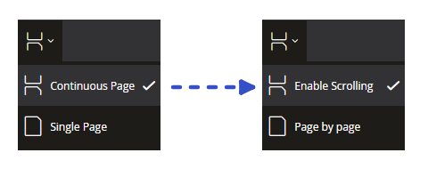
- Change display texts which are in `Dynamsoft.DDV.Elements.DisplayMode`.
```typescript
const newDisplayText = Dynamsoft.DDV.Elements.getDisplayTextConfig();
newDisplayText.DisplayMode_ContinuousPage = "Enable Scrolling";
newDisplayText.DisplayMode_SinglePage = "Page by page";
Dynamsoft.DDV.Elements.setDisplayTextConfig(newDisplayText);
const editViewer = new Dynamsoft.DDV.EditViewer({
container: "viewer",
});
```
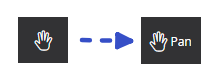
- Add display texts to default elements, take `Dynamsoft.DDV.Elements.Pan` as an example.
```typescript
const newDisplayText = Dynamsoft.DDV.Elements.getDisplayTextConfig();
newDisplayText.Pan = "Pan";
Dynamsoft.DDV.Elements.setDisplayTextConfig(newDisplayText);
const editViewer = new Dynamsoft.DDV.EditViewer({
container: "viewer",
});
```
- Change the position of the new-added display text relative to the icon. The default position of display text is on the right of the icon.

```typescript
// Add display text firstly.
const newDisplayText = Dynamsoft.DDV.Elements.getDisplayTextConfig();
newDisplayText.Load = "Load";
newDisplayText.Download = "Download";
newDisplayText.Print = "Print";
Dynamsoft.DDV.Elements.setDisplayTextConfig(newDisplayText);
// Set the relative position by using style-flexDirection of the default element.
// "column" means below the icon
// "row-reverse" means on the left of the icon
// "column-reverse" means above the icon
const newElements = [
{
type: Dynamsoft.DDV.Elements.Load,
style: { flexDirection: "column" },
},
{
type: Dynamsoft.DDV.Elements.Download,
style: { flexDirection: "column" },
},
{
type: Dynamsoft.DDV.Elements.Print,
style: { flexDirection: "column" },
}
];
const viewerUi = Dynamsoft.DDV.getDefaultUiConfig("editViewer");
const headerPart2 = viewerUi.children[0].children[1];
// Use newElements to replace the original ones.
headerPart2.children.splice(1, 3, ...newElements);
// Create the new viewer with updated uiConfig.
const editViewer = new Dynamsoft.DDV.EditViewer({
container: "viewer",
uiConfig: viewerUi,
});
```
**See Also**
-------
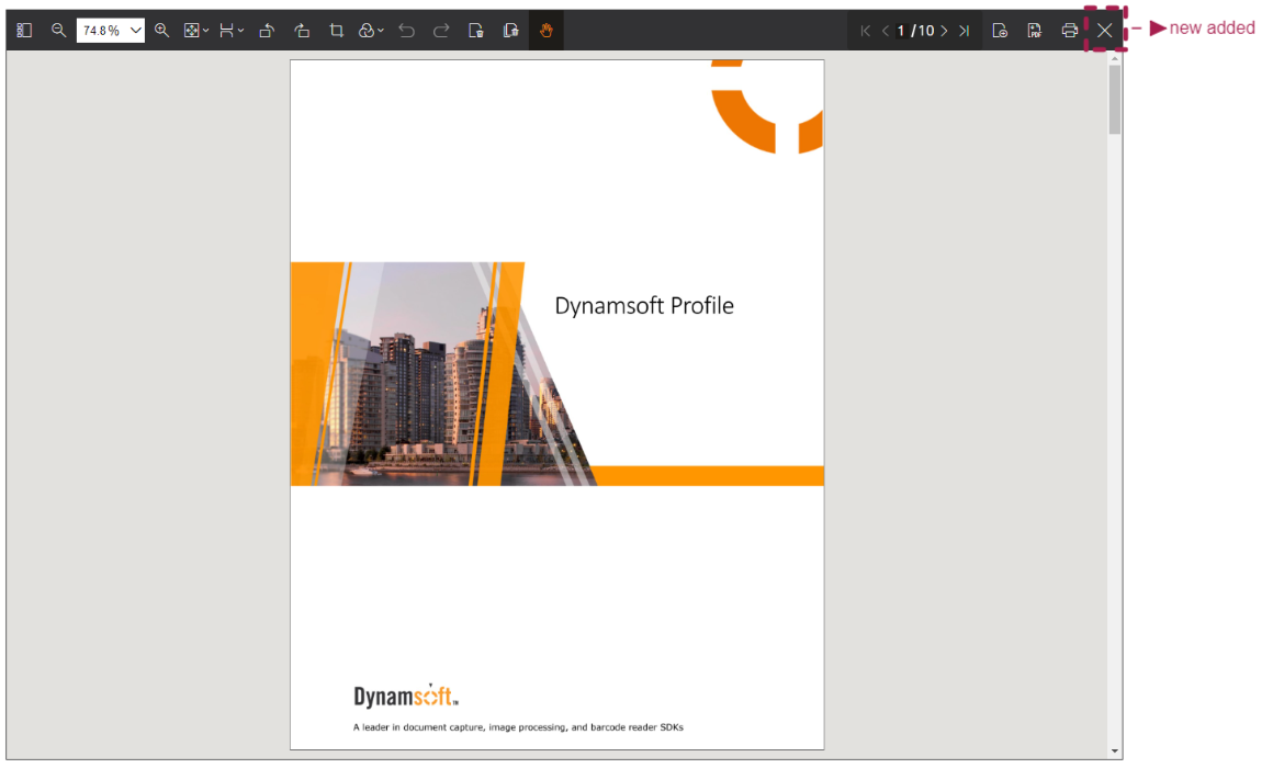
## Create your own button
Besides the default elements, you may need to create your own button to call other features or your own features. Then you can refer to the steps below to create a customized button.
- Step one: Configure a button UiConfig.
```typescript
const closeButton = {
type: Dynamsoft.DDV.Elements.Button,
className: "ddv-button-close", // Set the button's icon
tooltip: "close viewer", // Set tooltip for the button
events: {
click: "close", // Set the click event
},
};
```
- Step two: Place the button in the corresponding positions of the UiConfig and configure the UiConfig when creating the edit viewer.
```typescript
const uiConfig = Dynamsoft.DDV.getDefaultUiConfig("editViewer"); // Get the default UiConfig of EditViewer
const header = uiConfig.children[0];
header.children[1].children.splice(4, 0, closeButton); // Add the close button to the header's right
const editViewer = new Dynamsoft.DDV.EditViewer({
container: "viewer",
uiConfig: uiConfig,
});
```
- Step three: Configure the button's event in the specified viewer.
```typescript
editViewer.on("close", e => {
editViewer.destroy();
}
);
```