


How to Build an Angular PWA Document Scanner Desktop App with Dynamic Web TWAIN
A progressive web application (PWA) is a type of application software delivered through the web1. It is able to be installed like a local app so that we can access it later without an Internet connection.
In this article, we are going to build a document scanning desktop app with Progressive Web App support using Angular. Dynamic Web TWAIN is used to provide the ability to interact with document scanners.
The final app looks like this:
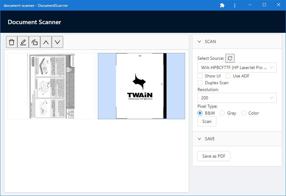
What you’ll build: A document scanning desktop application with PWA offline support using Angular and Dynamic Web TWAIN — featuring scanner selection, scan configuration, image editing tools, and PDF export.
Key Takeaways
- Angular PWA apps can interact with physical document scanners using Dynamic Web TWAIN, enabling offline-capable scanning workflows.
- The
AcquireImageAPI supports configuring resolution, pixel type, ADF, and duplex scanning through a singleDeviceConfigurationobject. - Converting an Angular app to a PWA requires only
ng add @angular/pwa— the service worker handles caching for offline use automatically. - Scanned documents can be edited (rotate, reorder, delete) in-browser and exported as a multi-page PDF.
Common Developer Questions
How do I scan documents from a physical scanner in an Angular web app?
Create and load a Dynamic Web TWAIN instance in the viewer component, wait for OnWebTwainReady, enumerate scanner sources, and call AcquireImage with a DeviceConfiguration object for pixel type, resolution, ADF, and duplex options.
Can an Angular PWA access hardware like document scanners offline?
Yes, as long as the Angular app is installed with PWA support and the local Dynamic Web TWAIN service is available on the machine. The Angular service worker handles offline caching, while the scanner bridge still talks to local hardware through the installed service.
How do I save scanned images as a PDF file using Dynamic Web TWAIN in Angular?
Use the image buffer indices from the viewer, then call the PDF save API on the WebTwain object to export a single multi-page PDF after users finish rotate, reorder, or delete operations.
Prerequisites
- Node.js and Angular CLI installed
- A TWAIN-compatible document scanner connected to your computer
- Get a 30-day free trial license for Dynamic Web TWAIN

Build an Angular Document Scanning App Step by Step
Step 1: Create a New Angular Project
ng new document-scanner
? Would you like to add Angular routing? Yes
? Which stylesheet format would you like to use? CSS
Then, we can run ng serve to test the app.
Step 2: Install Dynamic Web TWAIN and UI Dependencies
-
Install Dynamic Web TWAIN from npm:
npm install dwt -
We need to copy the resources of Dynamic Web TWAIN to the output’s assets folder.
Add the following to
angular.json:"build": { "options": { "assets": [ + { + "glob": "**/*", + "input": "./node_modules/dwt/dist", + "output": "assets/dwt-resources" + }, ], }, } -
We are going to use ng-zorro as the UI framework. Let’s install it as well.
ng add ng-zorro-antd
Step 3: Create the Document Viewer Component
Dynamic Web TWAIN provides a document viewer control and a bunch of APIs to scan and manage documents. We are going to wrap the viewer as an Angular component and expose the object of Dynamic Web TWAIN to call different APIs.
First, create a new component named document-viewer.
ng generate component document-viewer
Then, update its content with the following:
Template:
<div ngModel #viewerElement [id]="containerID"></div>
TypeScript:
import { Component, EventEmitter, Input, OnInit, ViewChild } from '@angular/core';
import Dynamsoft from "dwt";
import { WebTwain } from 'dwt/dist/types/WebTwain';

@Component({
  selector: 'app-document-viewer',
  templateUrl: './document-viewer.component.html',
  styleUrls: ['./document-viewer.component.css'],
  outputs: ['onWebTWAINReady']
})
export class DocumentViewerComponent implements OnInit {
  @ViewChild('viewerElement') viewerElement:any;
  onWebTWAINReady = new EventEmitter<WebTwain>();
  containerID = "dwtcontrolContainer";
  DWObject:WebTwain|undefined;

  constructor() {
    this.initDWT();
  }

  ngOnInit(): void {

  }

  initDWT(){
    Dynamsoft.DWT.RegisterEvent('OnWebTwainReady', () => {
      this.DWObject = Dynamsoft.DWT.GetWebTwain(this.containerID);
      if (this.onWebTWAINReady) {
        this.onWebTWAINReady.emit(this.DWObject);
      }
    });
    Dynamsoft.DWT.ProductKey = "<your trial license>";
    Dynamsoft.DWT.ResourcesPath = "assets/dwt-resources";
    Dynamsoft.DWT.Containers = [{
        WebTwainId: 'dwtObject',
        ContainerId: this.containerID
    }];

    Dynamsoft.DWT.Load();
  }
}
There are some additional props we can add to the component:
-
A license to activate Dynamic Web TWAIN. We can apply for a trial license here.
private _license:string; @Input() set license(license: string) { this._license= license; Dynamsoft.DWT.ProductKey = license; } get license(): string{ return this._license; } -
Width and height for the viewer.
private _height:string; @Input() set height(height: string) { this._height= height; } get height(): string{ return this._height; } private _width:string; @Input() set width(width: string) { this._width= width; } get width(): string{ return this._width; } constructor() { this._width = "100%"; this._height = "100%"; } initDWT(){ Dynamsoft.DWT.RegisterEvent('OnWebTwainReady', () => { this.DWObject.Viewer.width = "100%"; this.DWObject.Viewer.height = "100%"; this.viewerElement.nativeElement.style.width = this._width; this.viewerElement.nativeElement.style.height = this._height; }); //... } -
View mode for the viewer:
private _viewMode:{cols:number,rows:number} = {cols:2,rows:2};
@Input()
set viewMode(viewMode: {cols:number,rows:number}) {
  this._viewMode= viewMode;
  if (this.DWObject) {
    this.DWObject.Viewer.setViewMode(this.viewMode.cols,this.viewMode.rows);
  }
}
get viewMode(): {cols:number,rows:number}{ return this._viewMode; }
Step 4: Integrate the Viewer into the App Layout
Next, we are going to use the component in the app.
The viewer is placed on the left with a toolbar above it. A container of operation panels is placed on the right. There is also a header at the top.
Change the content of app.component.html to the following:
<nz-layout class="app-layout">
  <nz-header>
    <nz-page-header>
      <nz-page-header-title>Document Scanner</nz-page-header-title>
    </nz-page-header>
  </nz-header>
  <nz-layout>
    <nz-layout>
      <nz-content>
        <div class="left">
          <div class="toolbar">
          </div>
          <app-document-viewer height="calc(100% - 48px)" (onWebTWAINReady)="onWebTWAINReady($event)"></app-document-viewer>
        </div>
        <div class="right">
          <nz-collapse>
            <nz-collapse-panel nzHeader="SCAN" nzActive>
            </nz-collapse-panel>
            <nz-collapse-panel nzHeader="SAVE" nzActive>
            </nz-collapse-panel>
          </nz-collapse>
        </div>
      </nz-content>
    </nz-layout>
  </nz-layout>
</nz-layout>
The CSS:
.app-layout {
  height: 100vh;
}

nz-header {
  padding: 0;
  width: 100%;
  z-index: 2;
}

nz-content {
  margin: 12px;
}

nz-page-header-title {
  color:white;
}

.left {
  height: 100%;
  float: left;
  width: calc(100% - 300px);
}

.right {
  margin-left: 10px;
  width:290px;
  float:right;
}

.toolbar {
  padding: 5px;
  font-size: 21px;
  background-color: #fafafa;
  border: 1px solid #d9d9d9;
  border-bottom: 0;
  border-radius: 2px;
}
Next, we are going to implement different operations.
Step 5: Configure the Scan Panel
-
Add a
selectcomponent to select which scanner to use.The scanners list is loaded when Web TWAIN is ready or by clicking the reload button.
Template:
<nz-collapse-panel nzHeader="SCAN" nzActive>
  Select Source:
  <button (click)="loadScanners()" nz-tooltip nzTooltipTitle="Reload scanners" nzTooltipPlacement="bottom">
    <i nz-icon nzType="reload" nzTheme="outline"></i>
  </button>
  <div>
    <nz-select [(ngModel)]="selectedScanner">
      <nz-option *ngFor="let scanner of scanners" [nzValue]="scanner" [nzLabel]="scanner"></nz-option>
    </nz-select>
  </div>
</nz-collapse-panel>
TypeScript:
DWObject: WebTwain|undefined; selectedScanner: string = ""; scanners: string[] = []; onWebTWAINReady(DWObject:WebTwain){ this.DWObject = DWObject; this.loadScanners; } async loadScanners(){ if (this.DWObject) { const names = await this.DWObject.GetSourceNamesAsync(false) as string[]; this.scanners = names; if (names.length>0) { this.selectedScanner = names[0]; } } } -
Add checkboxes for configuring whether to show the scanning configuration UI, whether to enable auto document feeder (ADF) and whether to enable duplex scan.
<div> <label nz-checkbox [(ngModel)]="showUI">Show UI</label> <label nz-checkbox [(ngModel)]="useADF">Use ADF</label> <br/> <label nz-checkbox [(ngModel)]="duplex">Duplex Scan</label> </div> -
Add a resolution select.
<div> Resolution: <nz-select [(ngModel)]="resolution"> <nz-option [nzValue]="100" [nzLabel]="100"></nz-option> <nz-option [nzValue]="200" [nzLabel]="200"></nz-option> <nz-option [nzValue]="300" [nzLabel]="300"></nz-option> </nz-select> </div> -
Add three radios for pixel type selection. We can use this to set whether the scanned document’s pixel type is black & white, gray or color.
<div> Pixel Type: <nz-radio-group [(ngModel)]="pixelType"> <label nz-radio nzValue="0">B&W</label> <label nz-radio nzValue="1">Gray</label> <label nz-radio nzValue="2">Color</label> </nz-radio-group> </div> -
Add a
scanbutton to start scanning.Template:
<button nz-button (click)="scan()">Scan</button>TypeScript:
scan(){
  if (this.DWObject) {
    let selectedIndex = this.scanners.indexOf(this.selectedScanner);
    if (selectedIndex != -1) {
      let deviceConfiguration:DeviceConfiguration = {};
      deviceConfiguration.IfShowUI = this.showUI;
      deviceConfiguration.IfFeederEnabled = this.useADF;
      deviceConfiguration.IfDuplexEnabled = this.duplex;
      deviceConfiguration.SelectSourceByIndex = selectedIndex;
      deviceConfiguration.Resolution = this.resolution;
      deviceConfiguration.PixelType = this.pixelType;
      console.log(deviceConfiguration);
      this.DWObject.AcquireImage(deviceConfiguration);
    }else{
      this.DWObject.AcquireImage();
    }
  }
}
Step 6: Add PDF Save Functionality
In the save panel, add a button to save all the documents as a PDF file.
Template:
<nz-collapse-panel nzHeader="SAVE" nzActive>
  <button nz-button (click)="save()">Save as PDF</button>
</nz-collapse-panel>
The save function:
save(){
  if (this.DWObject) {
    const onSuccess = () => {
      alert("Success");
    }
    const onFailure = () => {
      alert("Failed");
    }
    this.DWObject.SaveAllAsPDF("Documents.pdf",onSuccess,onFailure);
  }
}
Step 7: Build the Document Toolbar
The toolbar has five buttons. We can use them to remove, edit, rotate and move selected documents.
Template:
<div class="toolbar">
  <button (click)="removeSelected()" nz-tooltip nzTooltipTitle="Remove selected" nzTooltipPlacement="bottom">
    <i nz-icon nzType="delete" nzTheme="outline"></i>
  </button>
  <button (click)="edit()" nz-tooltip nzTooltipTitle="Edit selected" nzTooltipPlacement="bottom">
    <i nz-icon nzType="edit" nzTheme="outline"></i>
  </button>
  <button (click)="rotateRight()" nz-tooltip nzTooltipTitle="Rotate selected" nzTooltipPlacement="bottom">
    <i nz-icon nzType="rotate-right" nzTheme="outline"></i>
  </button>
  <button (click)="moveUp()" nz-tooltip nzTooltipTitle="Move selected up" nzTooltipPlacement="bottom">
    <i nz-icon nzType="up" nzTheme="outline"></i>
  </button>
  <button (click)="moveDown()" nz-tooltip nzTooltipTitle="Move selected down" nzTooltipPlacement="bottom">
    <i nz-icon nzType="down" nzTheme="outline"></i>
  </button>
</div>
TypeScript:
edit() {
  if (this.DWObject) {
    let imageEditor = this.DWObject.Viewer.createImageEditor();
    imageEditor.show();
  }
}

removeSelected(){
  if (this.DWObject) {
    this.DWObject.RemoveAllSelectedImages();
  }
}

rotateRight(){
  if (this.DWObject) {
    this.DWObject.RotateRight(this.DWObject.CurrentImageIndexInBuffer);
  }
}

moveUp() {
  if (this.DWObject) {
    this.DWObject.MoveImage(this.DWObject.CurrentImageIndexInBuffer,this.DWObject.CurrentImageIndexInBuffer-1);
  }
}

moveDown() {
  if (this.DWObject) {
    this.DWObject.MoveImage(this.DWObject.CurrentImageIndexInBuffer,this.DWObject.CurrentImageIndexInBuffer+1);
  }
}
All right, we’ve now finished building the document scanning app.
Step 8: Enable Progressive Web App (PWA) Support
It is easy to make an Angular app a Progressive Web App using @angular/cli with the following command:
ng add @angular/pwa
PWA does not work using ng serve. We need to build the app and host it using an HTTP server.
ng build
python -m http.server # e.g. use Python to start the http server
Open the web page in Chrome. We can install it by pressing the button in the location bar.
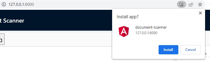
Then, we can use the app offline without an Internet connection.
You can learn more about Angular and PWA here.
Common Issues and Edge Cases
- Scanner not detected: Ensure the Dynamsoft Service is installed and running on the client machine. Dynamic Web TWAIN requires this local service to communicate with TWAIN/SANE/ICA scanners. Check the browser console for connection errors.
- PWA caching stale assets: After updating your app, the service worker may serve cached files. Use
ngsw-config.jsonto control cache versioning, and callSwUpdate.checkForUpdate()to prompt users when a new version is available. - Blank viewer on mobile browsers: Dynamic Web TWAIN’s desktop scanning features require the Dynamsoft Service, which is only available on Windows, macOS, and Linux. On mobile devices, consider using the camera-based capture mode instead.
Source Code
https://github.com/tony-xlh/angular-document-scanner